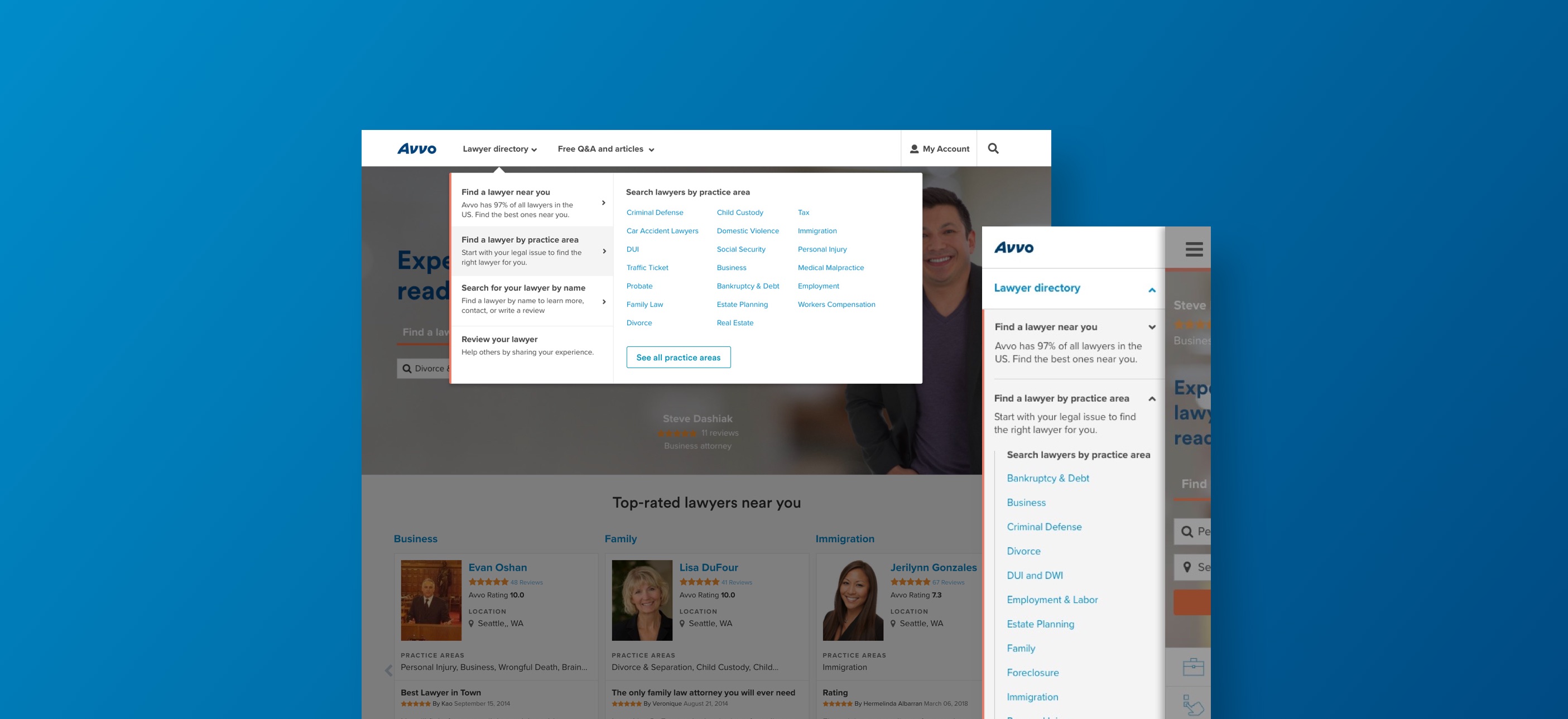
Avvo Global Navigation Redesign
UX Design
For many websites, the global navigation serves as a snapshot of what you are able to do on the site and what is offered. It serves as the North Star to reorient the user if they choose to reset their journey. I had the opportunity to work on Avvo's main global nav that millions of users visit every month. Working on a cross-functional team we aimed to create an improved version of the nav that not only communicated product offerings better, but also was most importantly user-centric.
The Problem to Solve
After witnessing customer struggles and extrapolating from site data our shortcomings, we believe we can improve the understanding of Avvo's offerings and encourage better cross-site navigation through an update to our global navigation.
How did we know it was a problem?
During previous usability sessions we've observed user's struggle with our global navigation especially when they have encountered the contextual component to it. Immediately users question why a menu suddenly changed and only serving a limited set of practice areas. We also knew that if that was ultimately confusing for the user it is confusing for the Google bot to understand our site, which greatly affected our SEO negatively.
Laying it out
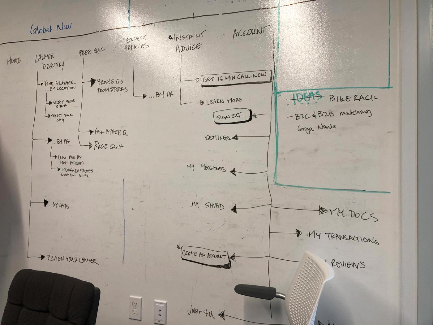
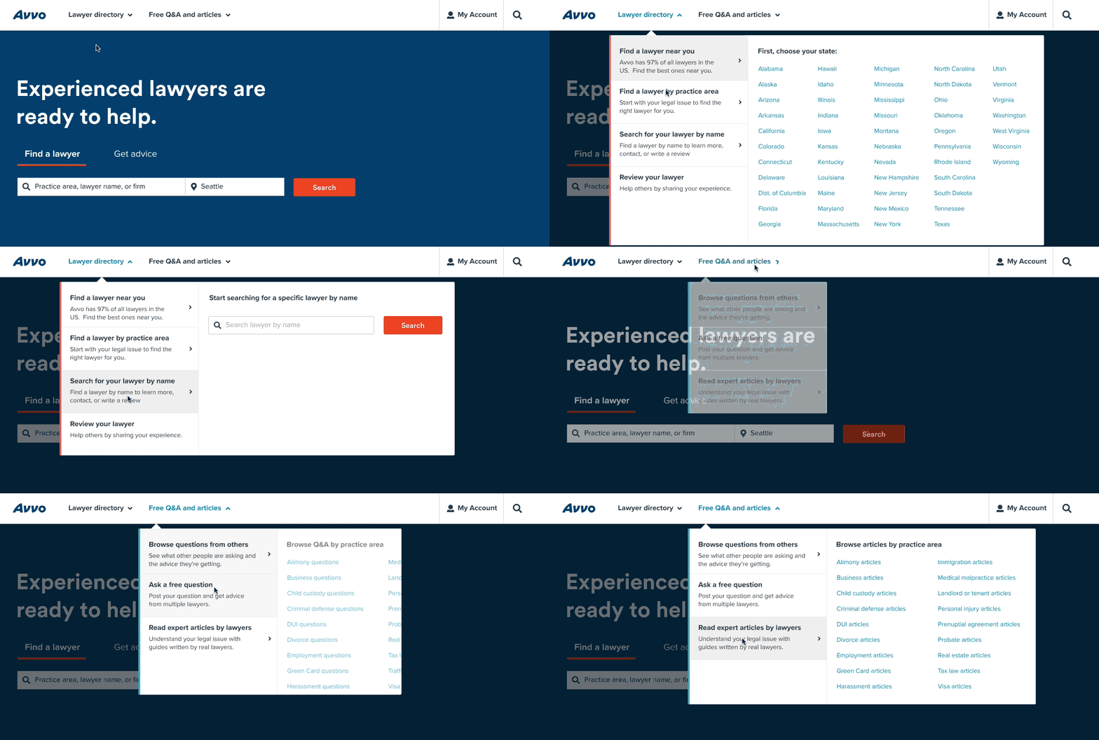
We worked with key stakeholders and started to whiteboard out the ideal navigation, focusing on providing a direct path to core tasks, while using language that would describe to the user of what they were getting into when they clicked on a nav item.
While doing this exercise this gave us the opportunity to put a link to our Q&A page, which is the page with the most traffic, in the forefront of our new menu.
Getting Treejack'd 🌳💪🏼
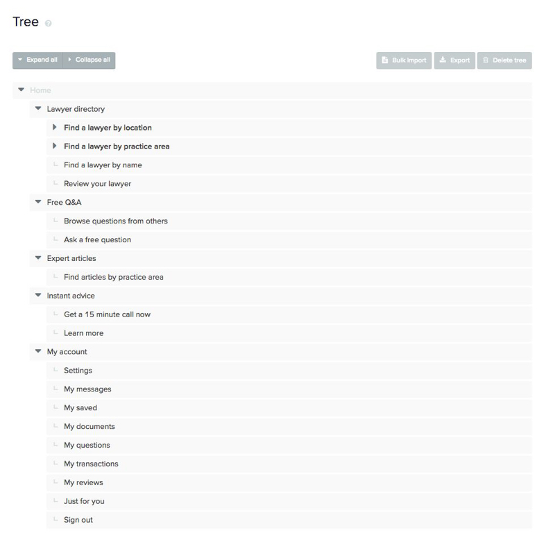
We worked with our UXR team to help formulate questions that would help us understand if our new nav structure matched the mental model of our users. In order to test this we created a Treejack test that simply tests the language used in a form of a decision tree of sorts. This was a unmoderated test where users were given specific tasks that asked them where they would find certain items within the nav based on certain scenarios/questions given.
Key takeaways
Using the language 'Lawyer directory' was still very successful directing people to finding a lawyer. Users still preferred to choose their location over bucketing themselves in a certain practice area. The verbiage of 'Q&A and articles' was successful in guiding people to the right content.
Design explorations

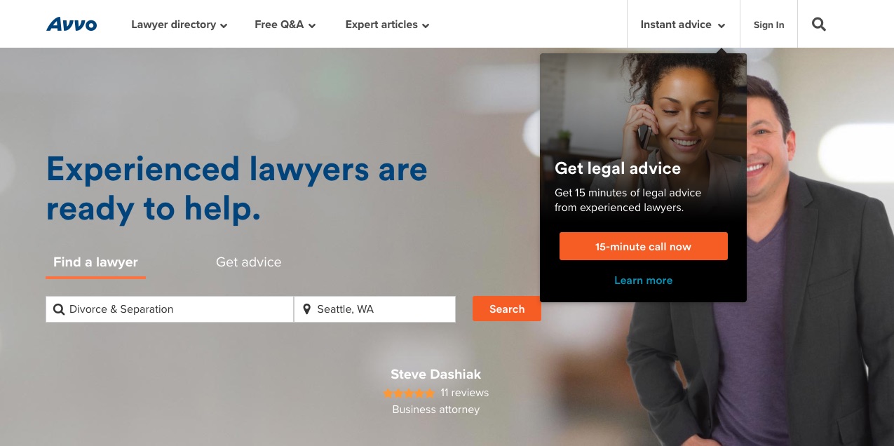
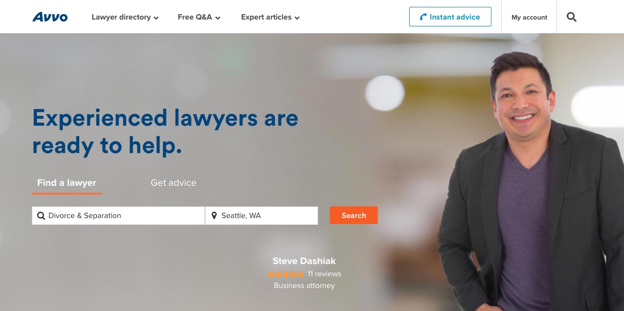
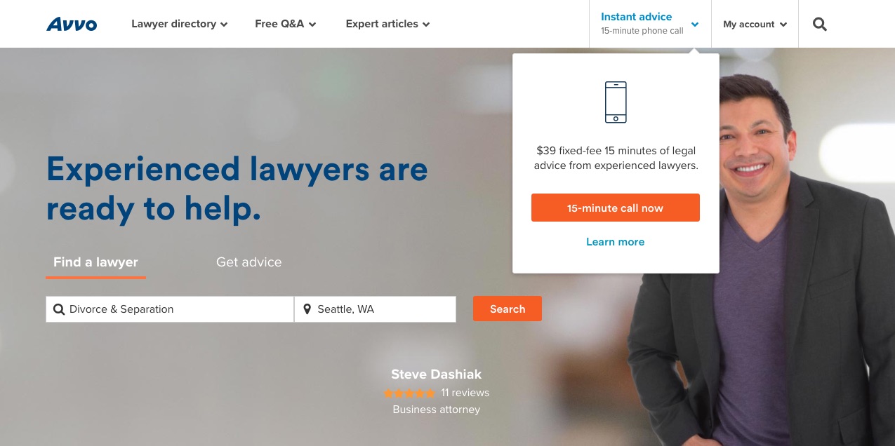
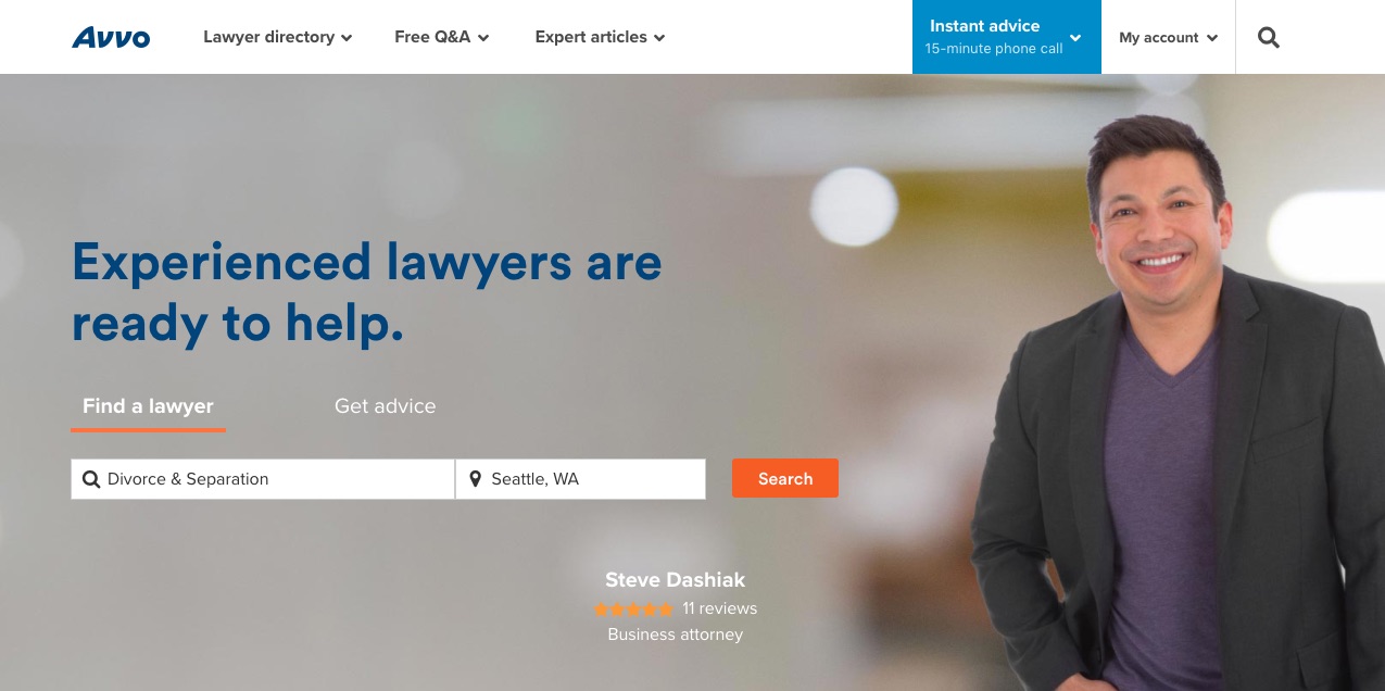
Bringing it to Lightning Lab
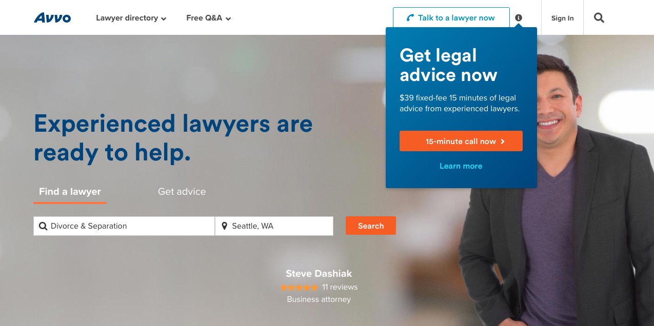
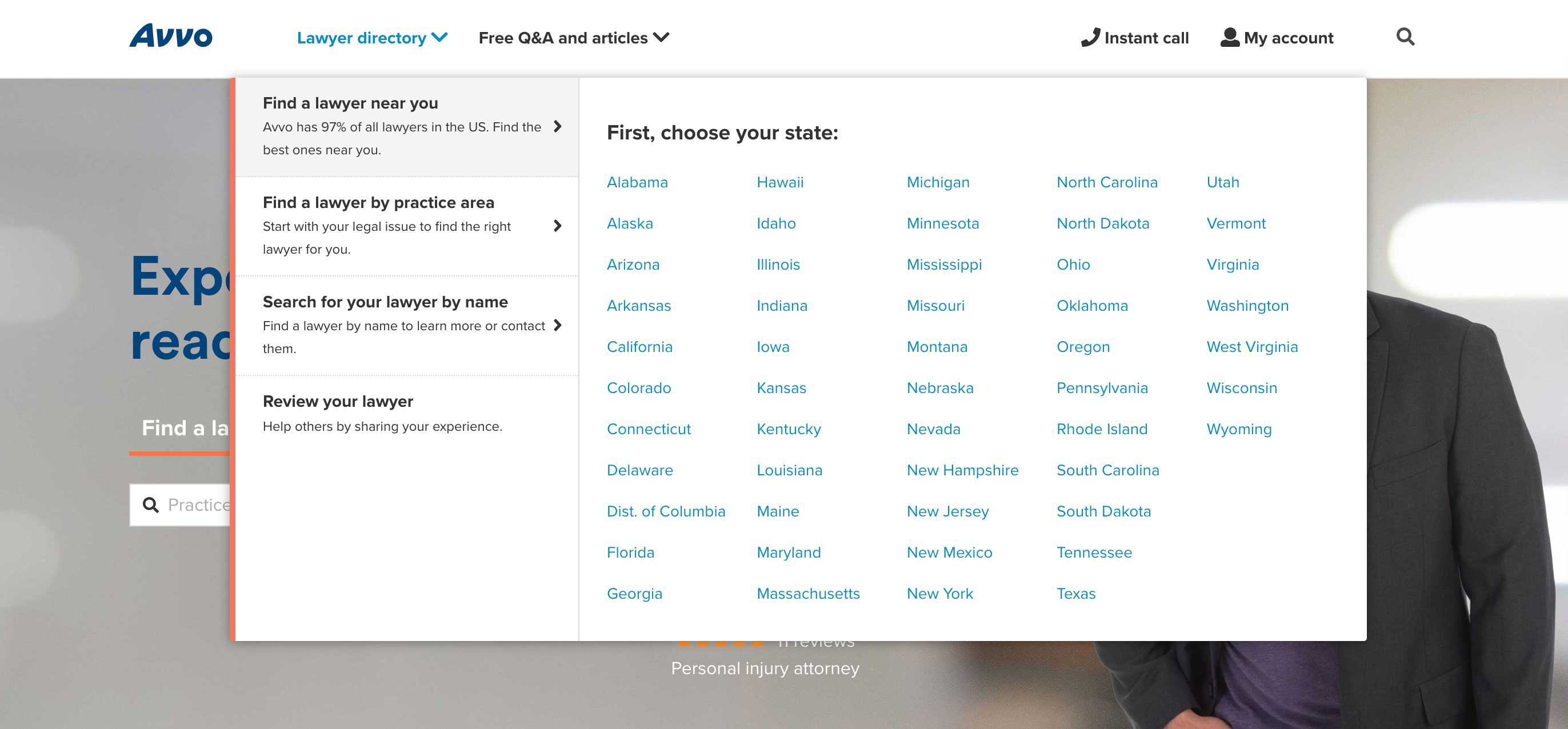
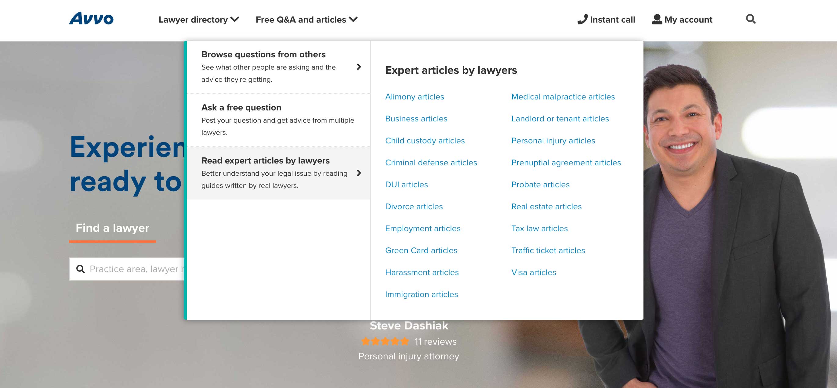
As we narrowed down our designs we wanted to get quantitative feedback and put it through our bi-weekly usability sessions called Lightning Lab. For the session we created a Chrome extension that overwrote Avvo's old global nav and replaced it with our proposed nav. We collaborated again with our UXR team and had five users come in and test the new nav by going through a series of tasks. We wanted to know if we met user's expectations, success rate of task completion, and if it was able to communicate what Avvo was as a company and what it offered.
Key takeaways
We observed that the rate of success for task completion was the highest it had ever been for the global nav. Users were able to quickly find what they were looking for from the tasks they were given. Based off of first impressions, users understood the purpose of Avvo and its product offerings before and after they interacted with the new nav. We were also pleasantly surprised that a few of the users were delighted with the global nav experience!
Testing into the concept
While we got positive qualitative feedback in Lightning Lab, we had to make sure that we would get positive quantitative data as well. In order to achieve this I coded several of A/B tests in Optimizely that broke up different parts of the concept. The reasoning was to monitor each individual change and to limit the amount of variables one is testing in order to obtain clean data. I monitored our metrics through Optimizely and also compared it to Google Analytics data.
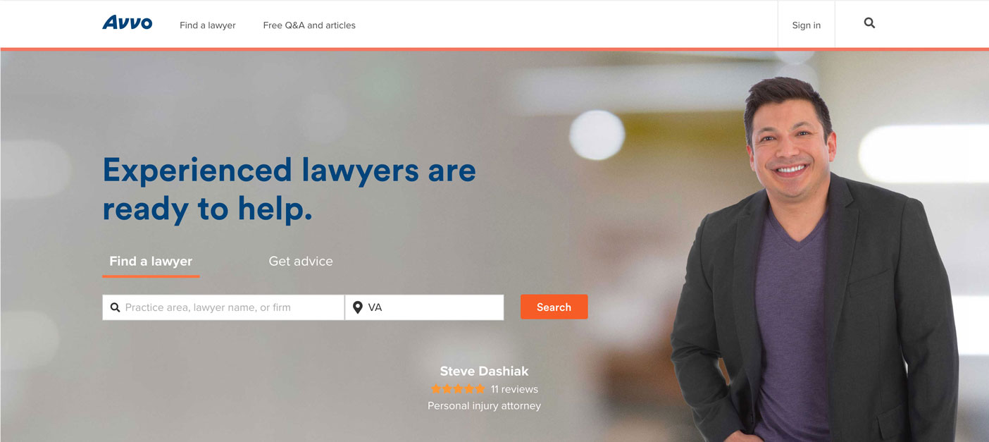
Test 1 – Relabel of nav items
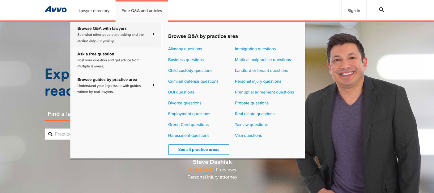
One of the biggest problems that we've seen from our users was that the naming of each nav item seemed too similar to each other. So for this test we wanted to use clearer language that helped communicated what exactly someone can expect when clicking on the nav item. We relabeled "Lawyer directory" to "Find a lawyer" and "Legal topics" to "Free Q&A and articles"
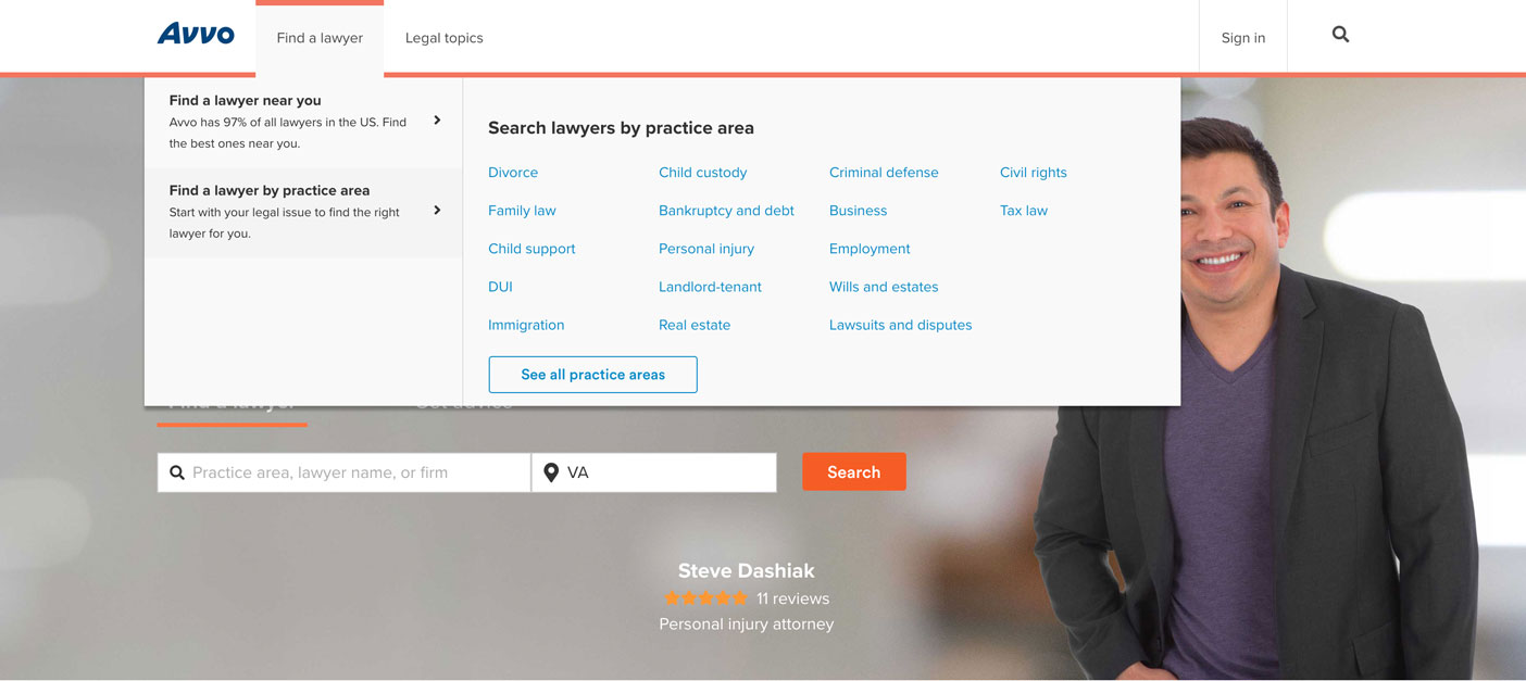
Test 2 – New directory menu
From the concept we applied the new dropdown menu to only the Lawyer directory and monitored our metrics to make sure we weren't driving traffic away from our high-valued pages.
Test 3 – New legal topics menu
Like the previous test we applied the new dropdown menu to only the Legal topics section and kept the old Lawyer directory styling.
Outcome
Looking at qualitative data from our tests we witnessed more clicks and visits to key performance pages and an increase in engagement with top-level or global nav items. From our data that we collected from usability sessions in Lightning Lab we succeeded in communicating the product offerings as well as summarizing what the company does on first impressions. The new nav not only created a better user experience navigating through the site, but it also addressed pressing SEO issues that made it difficult for Google to understand. Currently the work on putting the new global nav into production is in development!
